Network management is inherently spatial. Knowing what is failing is only half the battle; knowing where it is failing changes how your team responds.
We are thrilled to unveil the latest release of Optima NMSight, which introduces native Map View support. For engineering teams on the move, this release translates complex network telemetry into an intuitive, interactive geographical interface. As long as your network sites are configured with geo-location coordinates in the Optima NMS ecosystem, NMSight will now seamlessly plot their real-time status across a dynamic map display.
When managing hundreds or thousands of nodes, a mobile screen can quickly become cluttered. To solve this, NMSight features dynamic map clustering that condenses massive amounts of data into simple, digestible overviews when zoomed out.
Dynamic Data Condensation: When viewing an entire region or country, individual sites are automatically grouped into localized data clusters.
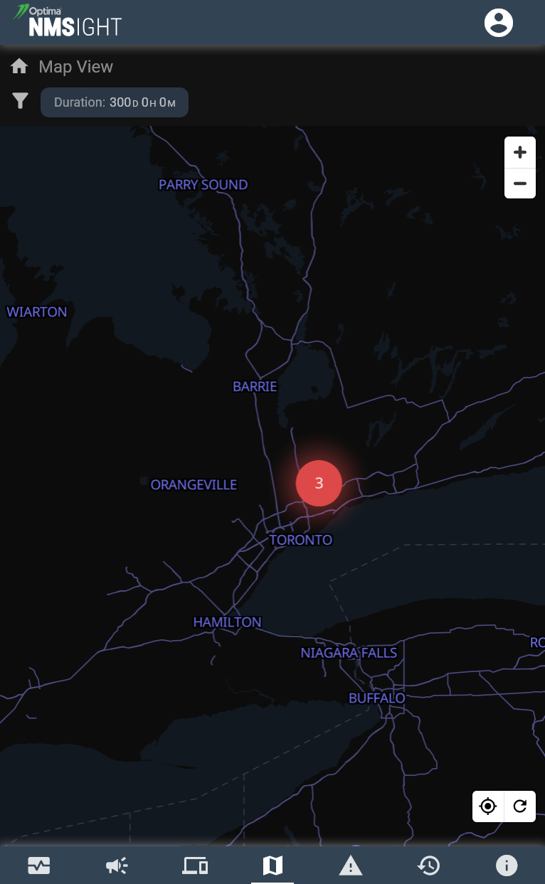
Instant Risk Assessment: Clusters display the total number of underlying events or affected nodes. The bubble uses a distinct colour indicator—such as the red cluster highlighting three active issues near Toronto—to alert you to regional trouble spots immediately. The cluster colour represents the highest alarm level currently being reported by that cluster.
One-Tap Drill Downs: Clicking on any of these summed-up totals bypasses the noise, instantly drilling down to display all the constituent alarms that have contributed to that specific “summary view.”
2. Dynamic Zooming: From Global Overview to Individual Sites
Navigating the geographical layout of your network is fast, fluid, and optimized for mobile touch gestures. Zooming in naturally unravels the data, breaking broad regional clusters into fine-grained local details.
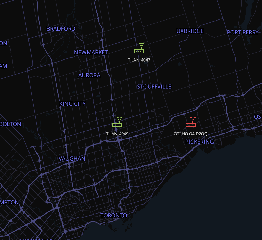
Granular Site Splitting: As you zoom into a region, the summed-up clusters gracefully split apart into individual, pinpointed sites.
The Highest-Alarm Rule: Each standalone site icon is illuminated in the colour representing the highest alarm level currently being reported by that location.
Colour-Coded Priority: Sites glowing in vibrant green represent perfectly healthy nodes where operations are normal. All other colours—such as amber for major warnings or red for critical faults—indicate that some level of active attention is required, making troubleshooting completely visual.
3. Micro-Level Diagnostics: The Device Pop-Up Display
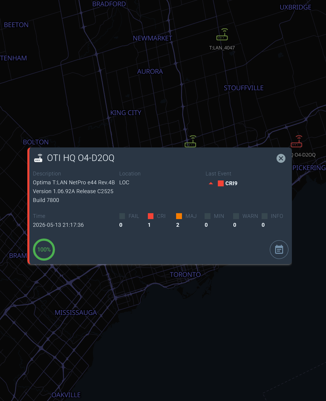
Once you zoom in and locate a troubled node, a single tap transitions you from macro-geography to micro-level network diagnostics.
Comprehensive Status Cards: A single tap on an individual device brings up an overlay pop-up detailing hardware descriptions, exact location tags, timestamps, and real-time availability metrics (like a 100% ping success ring). Double-tap a device icon does a deep-dive for that specific device (fast drill-down).
Severity Breakdown: The dialog breaks the device’s status down even further, itemising the exact counts per alarm severity level (including FAIL, CRI, MAJ, MIN, WARN, and INFO).
Deep-Dive Navigation: Want to see the exact fault? A further click on any specific severity count immediately opens the associated alarm logs for that exact level, allowing you to read event descriptions and assign notes on the fly.
Fast, Responsive Navigation
The true power of the new NMSight Map View lies in its responsiveness. Zooming out is just as lightning-fast and seamless as zooming in, allowing network administrators to flip from investigating a single rack deployment at a local headquarters to supervising an entire continental network in a matter of seconds.
By bringing geospatial context to mobile network monitoring, Optima NMSight ensures that your team always has the full picture, right in the palm of their hand.
Cluster Summaries
At the highest zoom level, all nearby sites are automatically condensed into a single cluster bubble, displaying a total event count and a colour-coded risk indicator.
A single tap on any cluster immediately drills down into every contributing alarm, letting you assess a regional outage in seconds without any manual filtering.
Pinpoint Site Icons
As you zoom into a region, clusters dissolve into individual site icons, each coloured to reflect its highest active alarm severity—green for healthy, amber for warnings, red for critical faults.
This makes field triage completely visual: you can spot problem sites at a glance and navigate straight to them without sorting through lists.
Device Pop-Up Details
Tap any site icon to open a rich Device Pop-Up showing hardware descriptions, location tags, real-time ping availability, and a full severity breakdown.
From there, tap any severity count to open the precise alarm log for that level—letting you read event descriptions and add notes on the fly, all without leaving the map.
Ready to see your network in a whole new light?
Update to the latest version of Optima NMSight today, or contact our team to find out how to activate Map View for your deployment.